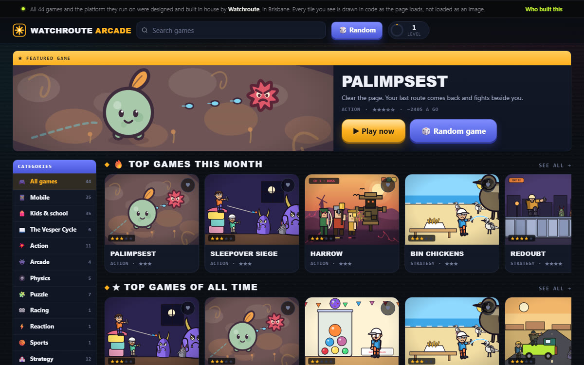
Watchroute +61 412 793 609 Start a project
Introductory pricing Every build is half its 1 October price until 30 September.
Selected work

Built to be
scrutinised.

The first two sell to overseas buyers who look a company up before they reply to an email. The third has to win a stranger out of a search result. The fourth sells books to parents at bedtime, and the last one is a rebuild, shown before and after, because a charity that could not take a volunteer is the clearest thing on this page. Below them sit eleven landing pages, long form sales pages and interactive tools, which is the same craft pointed at one decision instead of a whole company. Underneath, the brief was the same every time: load fast, read as established, and say nothing that cannot be verified.

+61 412 793 609 Call or textAndrew answers it himself, Brisbane time, Monday to Friday. One number for Australia and overseas: the link dials correctly from either.
16Live pages designed, built and shipped
LiveEvery one open in a browser right now
CustomWritten from scratch. No themes, no builders
QLDDesigned and built in Queensland
southerncrossprovisions.com
Australian food export
Single origin, traced to the hive.
Honey, truffle and native botanicals from named Australian producers, into Singapore, the Gulf and the United Kingdom.
ProducersMarketsStandards
01 / Food export

Southern Cross Provisions

A premium Australian food export brand selling honey, truffle and native botanicals into Singapore, the Gulf and the UK. Dark, cinematic and deliberately restrained, with background video used to carry atmosphere rather than decorate.

Built as a server-rendered React application on Cloudflare's edge, with bot protection on every form and a build guard that fails the deploy if unverified copy or a private phone number ever reaches the output.

  • Brand and art direction
  • React and TypeScript
  • Server rendered
  • Cloudflare Pages
  • Turnstile
Visit the live site

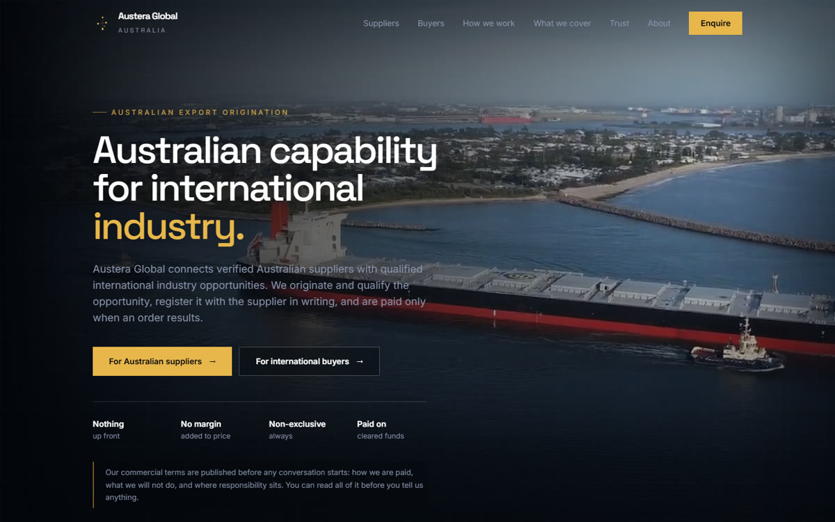
austeraglobal.com
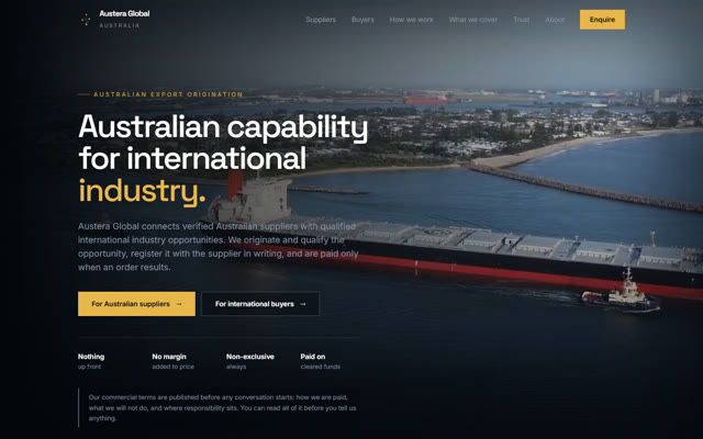
Industrial export agency
Australian equipment, placed properly.
Mining and industrial supply into overseas markets, with published commercial terms and a documented supplier assessment standard.
SuppliersTrust centreTerms
02 / Industrial export

Austera Global

The parent company: an Australian export agency placing mining and industrial equipment into overseas markets. A harder, more technical register than its sister brand, aimed at procurement managers rather than chefs.

The site carries a full trust centre, published commercial terms and a supplier assessment standard, because the audience checks all three before they make contact. Twenty three pages, all statically prerendered.

  • Information architecture
  • Trust and compliance
  • Technical SEO
  • Edge functions
Visit the live site
watchrouteguide.com
Guides and reviews
The best online casinos in Canada, ranked for 2026.
Rated on game range, mobile experience and payout speed, with the affiliate relationship disclosed on the page it appears on.
GuidesPaymentsResponsible play
03 / Publishing and SEO

Watchroute Guide

A content-led review publication in the Canadian online gaming market, and the only build here that has to earn a stranger out of a search result rather than out of an email. Forty four pages arranged into five silos, guides, bonuses, payments, news and responsible play, each with its own hub and a set of supporting articles that link to one another rather than sitting in a heap.

It is a regulated subject, so the build carries the furniture that comes with that: a standing exclusion notice for Ontario visitors, a disclaimer, a published editorial policy, responsible gambling messaging on every page that recommends anything, and a consent platform in front of the advertising and analytics. Static, prerendered and served from Cloudflare's edge.

  • Content architecture
  • Editorial design
  • Technical SEO
  • Consent and disclosure
  • Cloudflare Pages
Visit the live site
lanternpathbooks.com
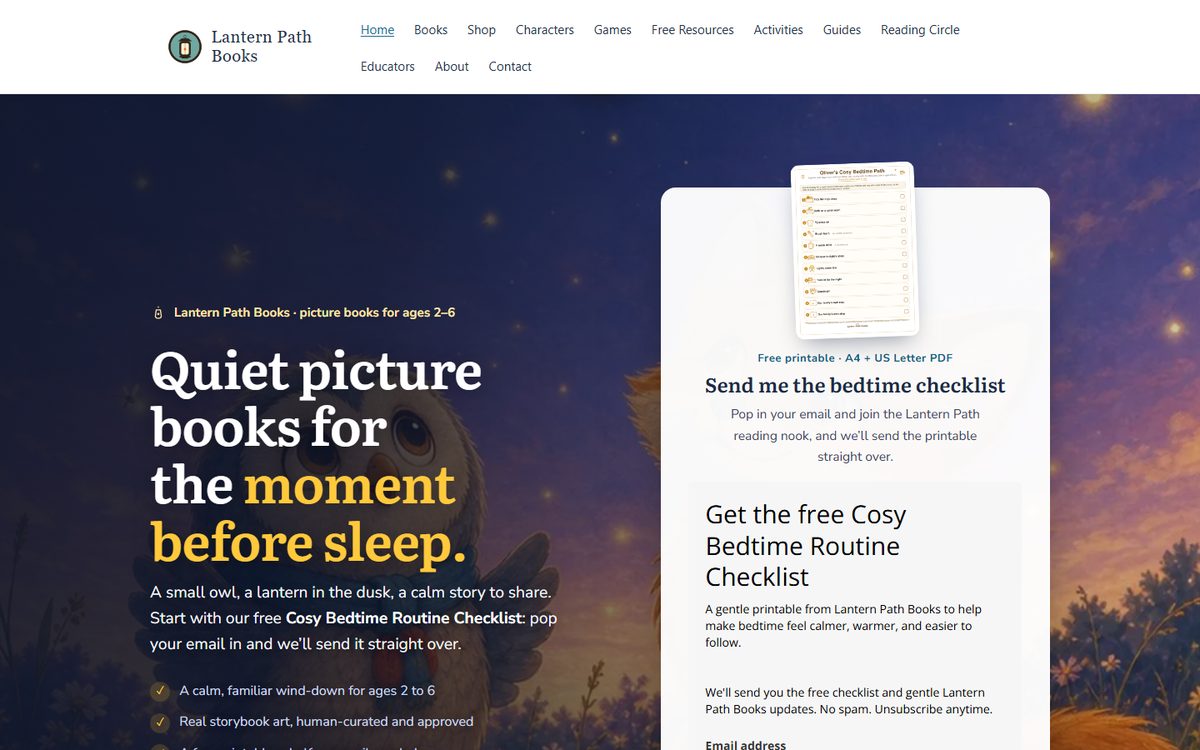
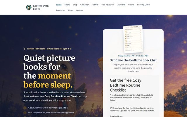
The Lantern Path Books home page: a night sky illustration behind the headline Quiet picture books for the moment before sleep, with a free bedtime checklist signup beside it.
04 / Children's publishing

Lantern Path Books

An independent picture book publisher for ages two to six, selling direct rather than through a shopfront. The site has to do three jobs at once: sell books, give away enough free printables to be worth a parent's email address, and stay calm enough to suit the half hour before bedtime.

It is the largest build here by some distance, with a shop, character pages, games, activities, guides, free resources and an educator section. Analytics are cookieless by default and anything that would set a cookie sits behind an explicit consent choice, which is unusual for a store and was a deliberate call.

  • Brand and art direction
  • Ecommerce
  • Lead magnets
  • Cookieless analytics
  • Cloudflare Pages
Visit the live site
Beforedailybreadhouse.org
dailybreadhouse.org
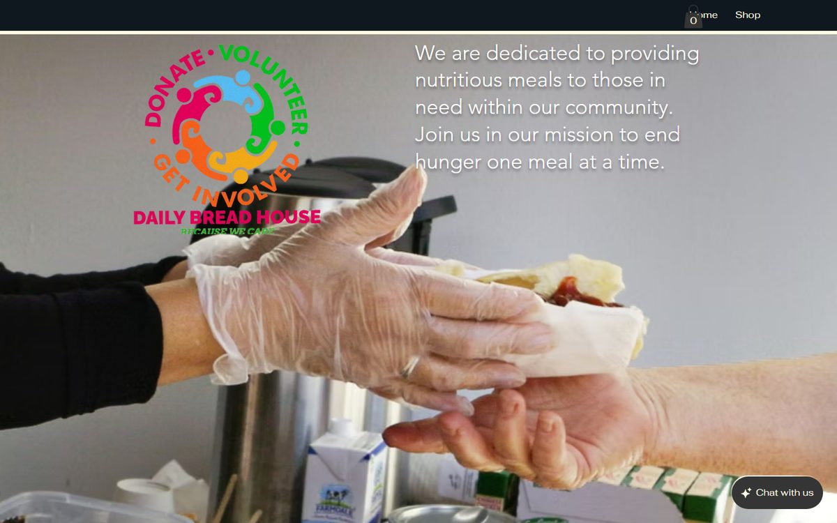
The old Daily Bread House site: a full bleed photograph of a meal being handed over, with the logo and a paragraph of text laid over it, a two item menu reading Home and Shop, and a chat widget in the corner.
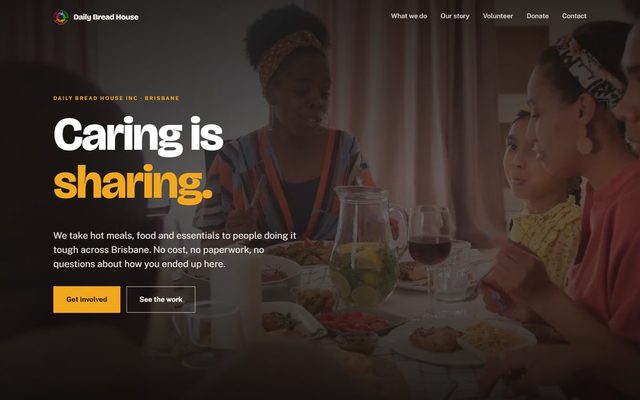
Afterdailybreadhouse.com
dailybreadhouse.com
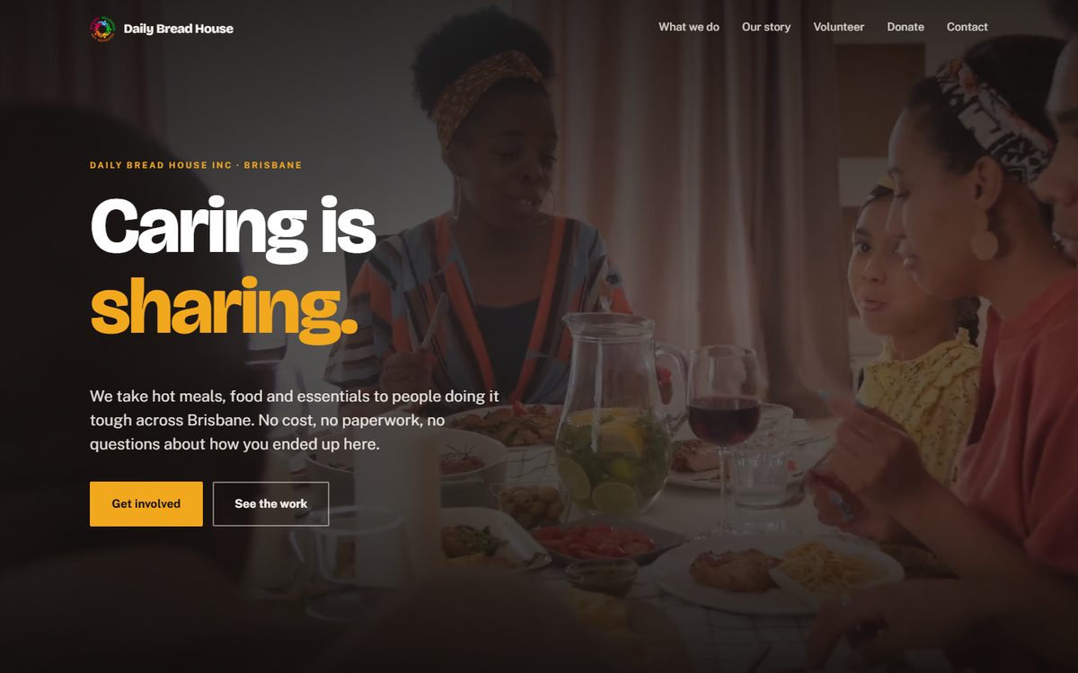
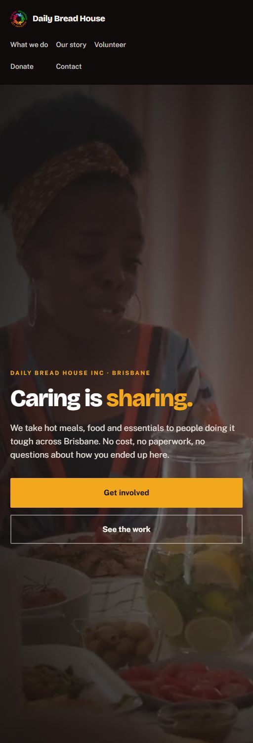
The rebuilt Daily Bread House site: the headline Caring is sharing over a photograph of people eating together, a short line explaining the service, Get involved and See the work buttons, and a six item menu.

The same two sites on a phone, which is where most of their visitors are.

Beforeon a phone
dailybreadhouse.org
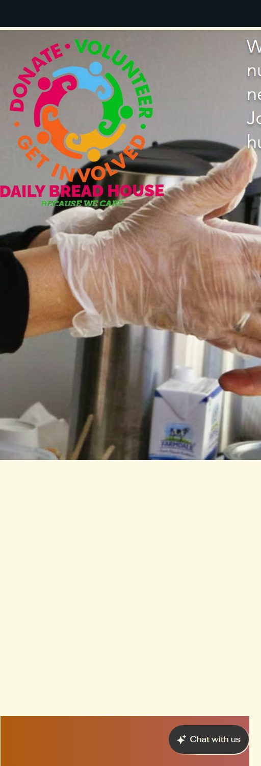
The old Daily Bread House site on a narrow screen. The paragraph of hero text is cut off at the right edge, so only the first two or three letters of each line are visible, and below the photograph is a tall band of empty cream coloured space.
Afteron a phone
dailybreadhouse.com
The rebuilt Daily Bread House site on the same narrow screen. The full menu, the headline, the description and both buttons all fit, with nothing cut off.
05 / Charity rebuild

Daily Bread House

A Brisbane charity taking hot meals and essentials to people doing it tough. The old site was a template with two menu items, Home and Shop, and no way to volunteer. Below the fold it ran to about three and a half screens holding two short paragraphs, two photographs and a large block of flat colour, so most of the page was empty. On a phone the opening sentence ran off the right edge and could not be read at all.

The rebuild is eight pages written from scratch around the three things the charity actually needs from a stranger: understand the work, volunteer, or donate. Their own photography and video carry it, the volunteer form works and is bot protected, and the whole thing runs on Cloudflare Pages and Workers behind a strict content security policy.

  • Rebuild and redesign
  • Copywriting
  • Volunteer form
  • Strict CSP
  • Cloudflare Pages and Workers
Visit the live site
A note on what you are looking at. The first three panels are built in each site's own design system rather than being screenshots. The last two are real captures, unretouched, because a rebuild is worth nothing to you if the before was drawn by the person selling the after. Both Daily Bread House sites were photographed on 25 August 2026 at the same two window sizes, 1440 pixels wide and 512 pixels wide, and the before was taken while the old site was still answering. It has since been taken down, so it can no longer be checked, which is exactly why the capture says what size it was taken at. Every website link goes straight to the real thing, which is the only review that counts. The landing pages are shown but deliberately not linked, and the reason is below. Every panel in the landing pages section below is a real capture too, taken on 29 August 2026 at 1440 pixels wide and again at 390, which is why the phone view sits beside the desktop one rather than being described. The pixel heights quoted against each one are the real page heights at 1440 wide.

And the thing worth saying plainly. Every page on this page belongs to us or to a charity founded by a relative. None of it is arm's length client work, because we are a young studio and do not yet have any to show. We would rather show you the work than imply relationships we do not have. The websites are all linked and you are welcome to open any of them and read the source. The landing pages are shown but not linked, on purpose. They are live commercial assets in a market we actually compete in, and a sorted index of them is a different thing from a portfolio. If you want to be walked through one, ask and we will do it properly. If you want to speak to a paying client before hiring us, ask, and you will get a straight answer about where we are.

3 entries

Interactive tools

Calculators and multi step engines that run entirely in the browser, built to hold the attention of somebody who arrived from an ad and has never heard of the business. No backend, no account, nothing to install.

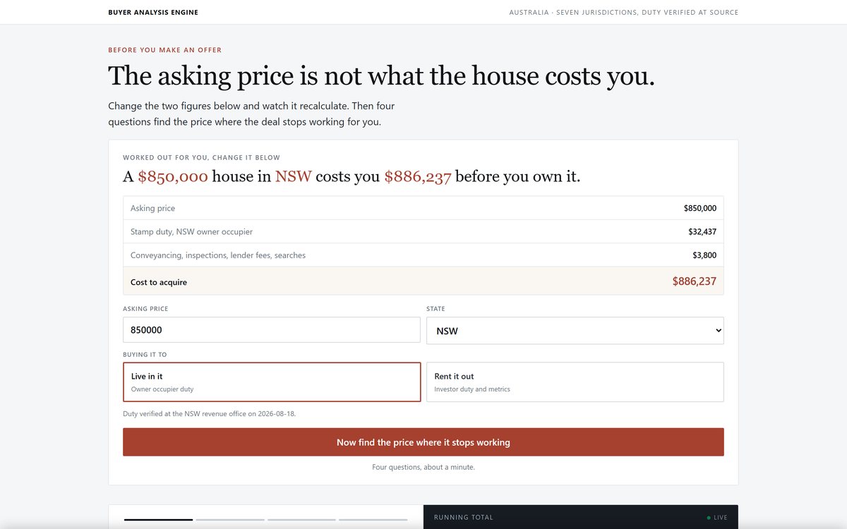
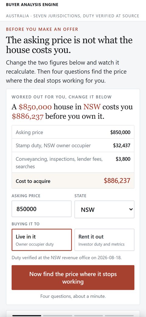
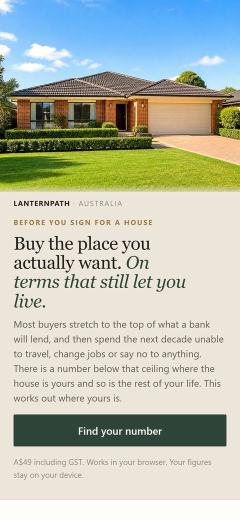
A stepped calculator interface on a light background.
The same calculator at phone width.

Interactive tool

Stepped affordability calculator

A guided calculator that recalculates on every keystroke and reflows from a single desktop screen to a stacked phone layout.

  • Stepped input flow with live recalculation
  • All arithmetic runs client side, so nothing is transmitted
  • Result panel cannot render an incomplete state
1,612pxvanilla JSno backend
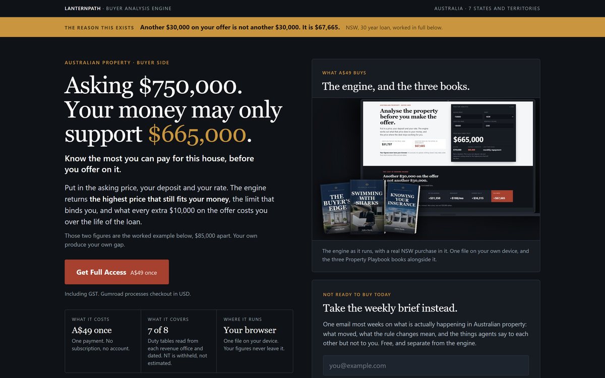
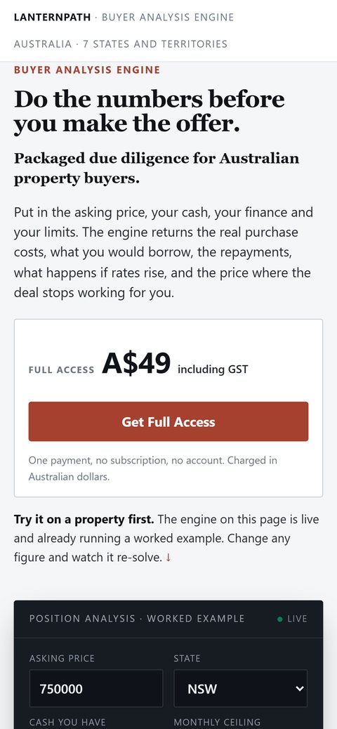
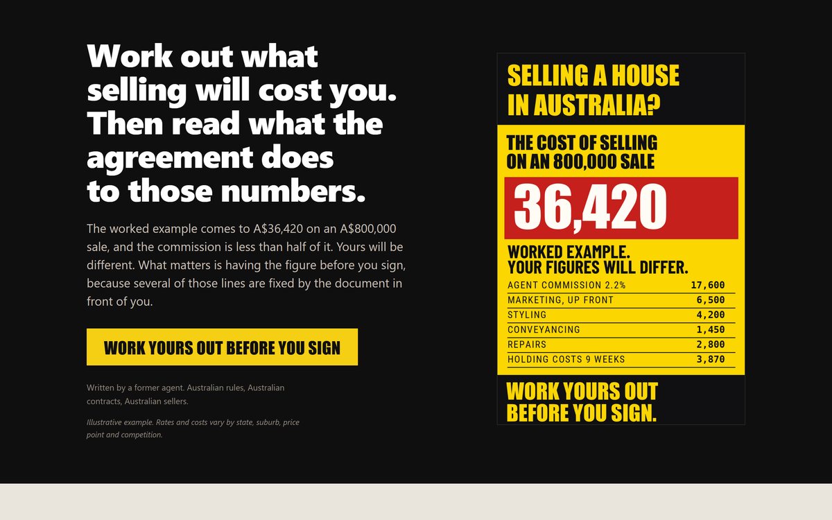
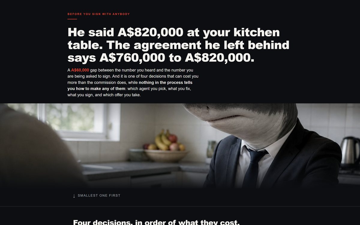
A dark landing page headlined on an asking price against what the buyer's money actually supports, with a product render beside it.
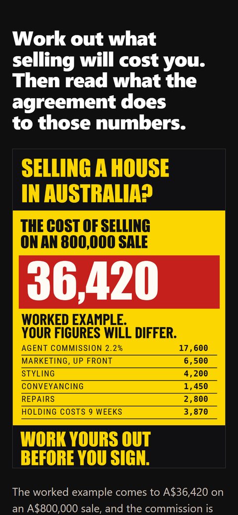
The same page at phone width.

Long form direct response

Leads with the answer, then the argument

The page opens with the number the visitor came for, worked on a real purchase, with the product sitting beside it. The reasoning follows underneath rather than standing in front of it.

  • The answer, the product and the price share the first screen
  • Progressive disclosure down 7,021px of page
  • A weekly brief offered as the second path for anyone not ready to buy
7,021pxanswer firstproduct render
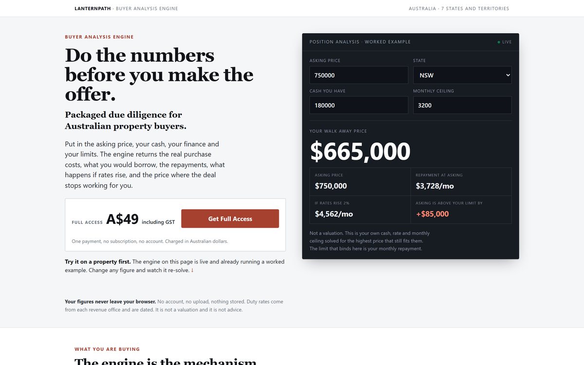
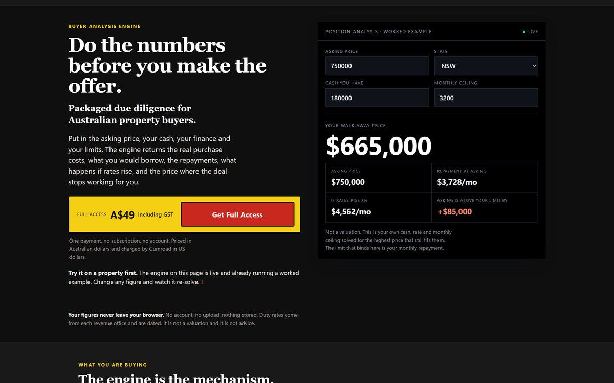
A light product page with a dark calculator panel beside it, resolving a walk away price of $665,000.
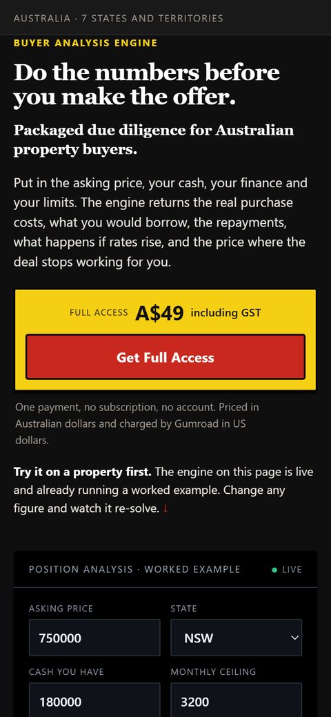
The same product page at phone width.

Tool plus product page

Working calculator in the first screen

A short product page where a live calculator and the price occupy the same opening screen, so a visitor can put their own figures in before they scroll anywhere.

  • Fourteen live input fields, the first of them on the opening screen
  • Persistent offer bar built in CSS, no library
  • Built to be read inside another app's browser
5,023pxlive engineprice above the fold
Tool plus product page

Long form sales pages

Pages whose job is to take a cold visitor from a headline to a purchase decision without a salesperson in the room.

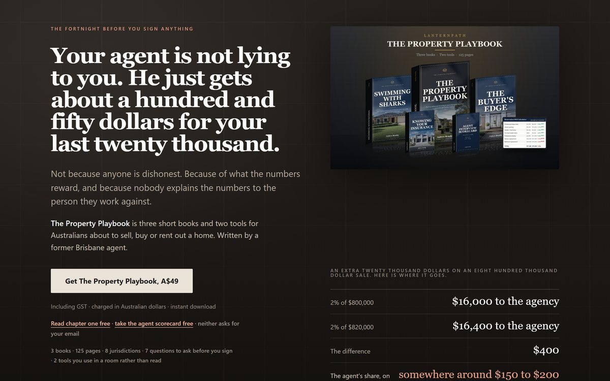
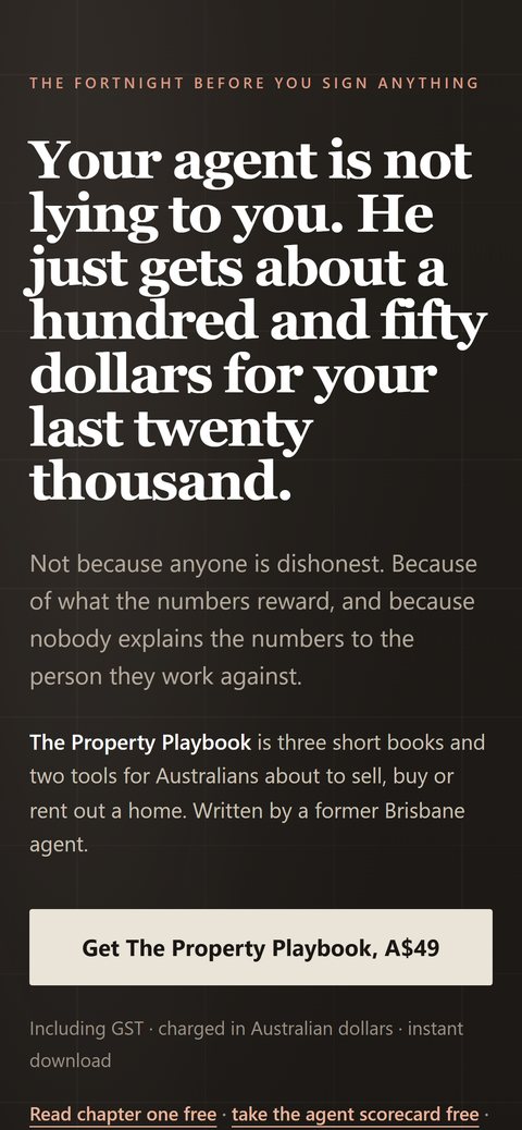
A long form sales page, dark, with a headline over a product render.
The same page at phone width.

Long form sales page

The longest page we have shipped

Nearly twenty seven thousand pixels of argument, arithmetic and proof, built as one continuous read rather than a series of sections.

  • Animated arithmetic ledger built in code, not a static graphic
  • Custom product photography and 3D renders generated in house
  • Holds its layout from 320px to ultrawide
26,928pxzero page buildercustom imagery
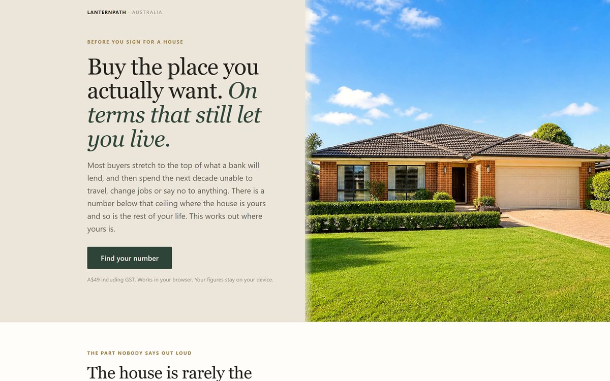
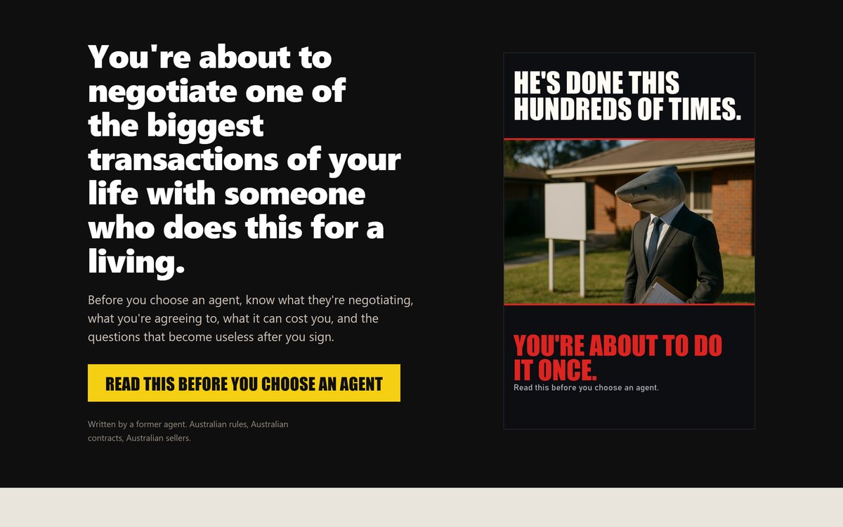
A split hero landing page with a serif headline and a photograph.
The same page at phone width.

Editorial landing page

Split hero with serif display

A split hero that collapses cleanly to a single phone column, with a mixed roman and italic display setting.

  • Full bleed split layout that collapses to one column
  • Mixed roman and italic display setting
  • One call to action on the entire first screen
3,226pxeditorial type
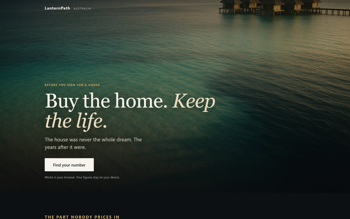
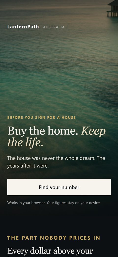
A landing page with a serif headline over a dark photograph.
The same page at phone width.

Editorial landing page

Second visual treatment, same structure

Built as a genuine variant of the page above: one variable changed and the stylesheet shared, so the two can be compared rather than argued about.

  • Shares a stylesheet with its counterpart
  • One variable changed, everything else held
  • Same structure, different art direction
4,656pxA/B ready
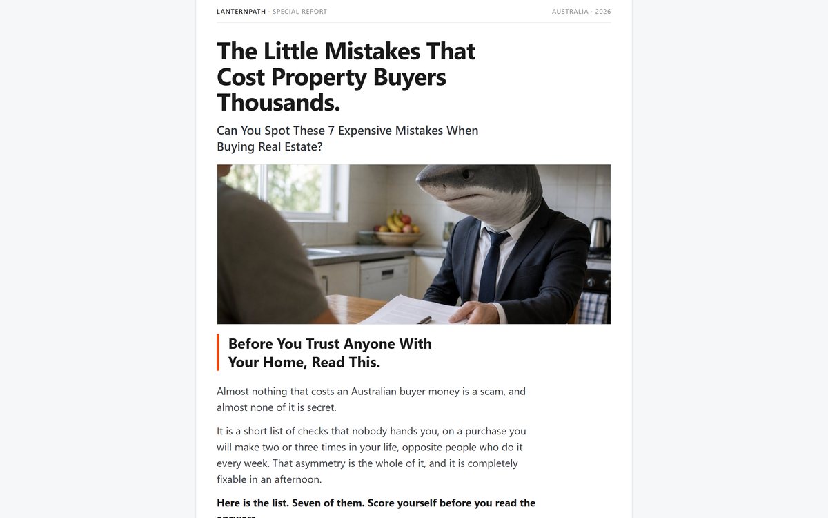
An article style landing page with a photograph and a headline.
The same page at phone width.

Long read layout

Article pacing, magazine setting

An article first layout with body text tuned for sustained reading rather than scanning, and images that carry their own captions.

  • Article first pacing with measured line length
  • Body text tuned for reading rather than scanning
  • Captioned imagery held in the text column
5,263pxadvertorial
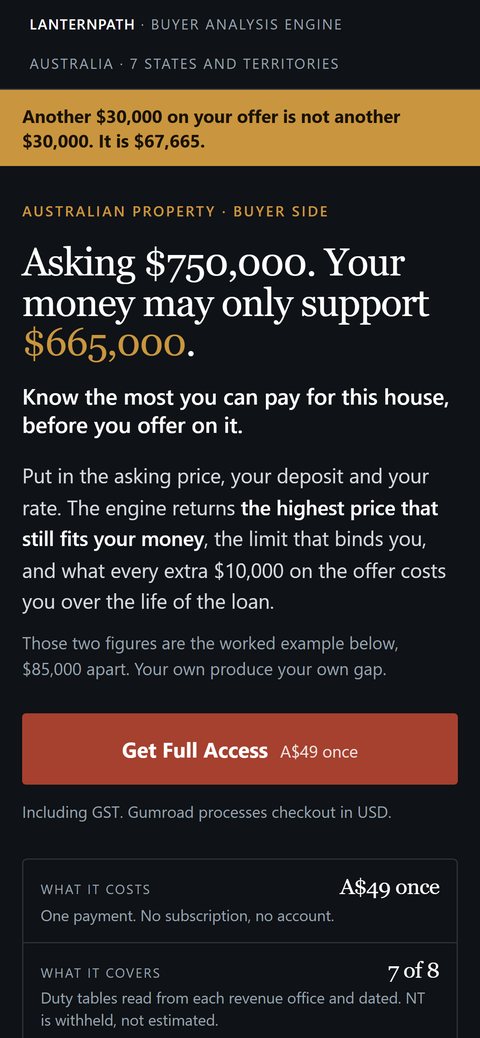
A dark landing page with a gold accent and a live calculator panel resolving a walk away price of $665,000.
The same calculator page at phone width, with the panel stacked under the headline.

Interactive tool

Live calculator, dark treatment

The visitor types in their own asking price, deposit and rate, and the panel resolves the highest price the deal still works at. Every figure recalculates on the page and nothing they enter leaves the browser.

  • Live recalculation on every keystroke
  • All arithmetic runs client side, nothing is transmitted
  • The result panel cannot render an incomplete state
live engineclient side mathsdark UI
Interactive tool

Lead capture and content

Free assets built to earn an email from cold traffic honestly, with the form placed where it does not cannibalise the sale.

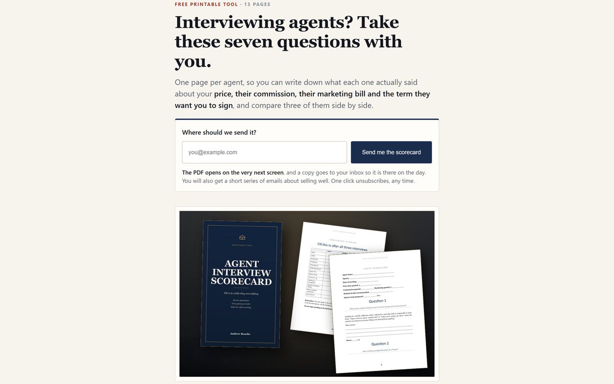
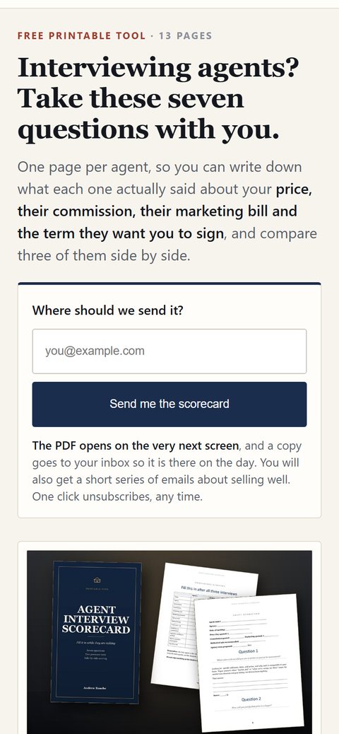
A lead capture page: a single email field and a send button above a photograph of the printed scorecard document.
The same lead capture page at phone width, with the form under the headline.

Lead capture

Email capture in the first screen

A cold visitor arrives, sees exactly what they get, and hands over an address without scrolling. One field, one button, and microcopy that says what arrives and when.

  • One field and one button, nothing optional
  • Says what arrives, when, and how to stop it
  • Server side subscribe endpoint, not a third party embed
single fieldserver side APIcold traffic
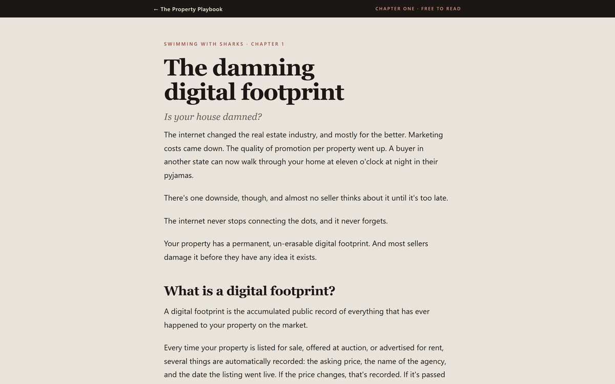
A long reading page set in a serif typeface.
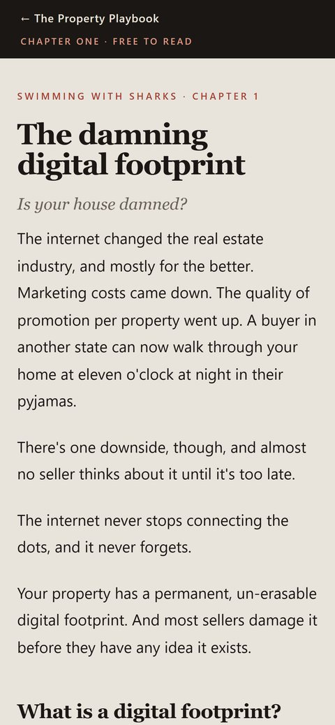
The same page at phone width.

Long read

Typographic reading layout

A full chapter set for screen reading, with a leading and type scale chosen for sustained reading rather than skimming.

  • Typographic hierarchy carried across thousands of words
  • Leading and measure set for sustained reading
  • Pull quotes that survive the drop to one column
4,997pxreading typography
A resource page in a soft palette with a document preview.
The same page at phone width.

Health sector resource

Restrained layout, sensitive subject

A sixteen thousand pixel resource page in an entirely different register, because tone is most of the job when the subject is a medical appointment.

  • Restrained palette and pacing suited to the subject
  • No countdowns, no urgency devices, no pressure patterns
  • Shows the studio can leave its usual voice at the door
16,457pxhealth sectortone led
Health sector resource

How these are built

The same approach we would bring to your site.

Hand written, not assembled

No page builder, no theme, no plugin stack. That is why a 26,928px page still loads quickly and why nothing breaks when a plugin updates itself at 2am.

Mobile is not an afterthought

Every page here is designed at phone width first, then opened out. Traffic from social and search often lands inside another app's browser rather than a real one, which is the harshest environment there is, so that is where these get tested.

Tracking that actually fires

First party event collection on our own infrastructure, verified against the database rather than assumed. We check that a conversion is recorded before anyone spends money sending traffic.

Copy is part of the build

Every headline, caption and button on these pages was written in house. A layout cannot rescue a page that has nothing to say.

Fast hosting by default

Static pages served from a global edge network, with server side functions only where a form or a payment genuinely needs one.

Built to be measured

Where two designs are worth comparing, we build them as true variants so the winner is decided by cost per sale rather than by whoever argues hardest.

Anyone can show you a pretty homepage. Ask whether it still loads in two seconds on a phone in a shed.

All sixteen of these do
Start here

Want something built to the same standard?

Tell us who you are trying to convince and what they check before they contact you. One sentence is enough. You get a written price and which of the builds it is, usually within one business day, and if we are not the right studio for it we will say so.

Start before 30 September and you pay half the 1 October price.

A five page build is $2,400 now and $4,900 from 1 October. The number goes into the written quote and does not move afterwards.

Get a price for your site