Pages you can open right now.
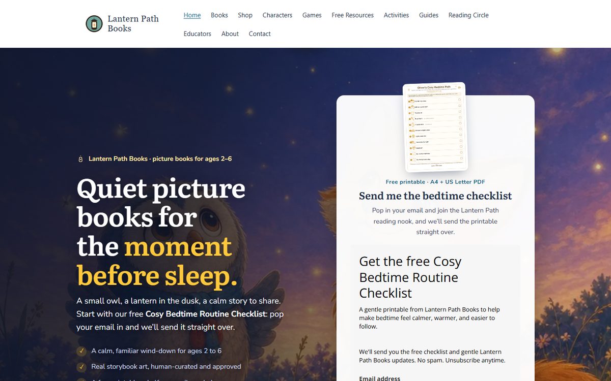
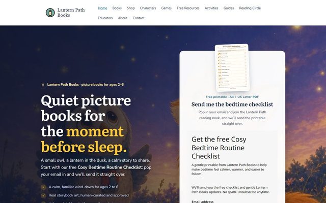
A sample of the cold traffic landing pages we design, write and ship. Every one is live, and every one has had strangers arrive on it from a paid ad with no idea who we are, which is a harder job than converting a warm list. Underneath, the full websites, and the arcade we built for nobody. Nothing here is a mock up and nothing was built to fill this page. More of the work sits on the work page.
Landing pages
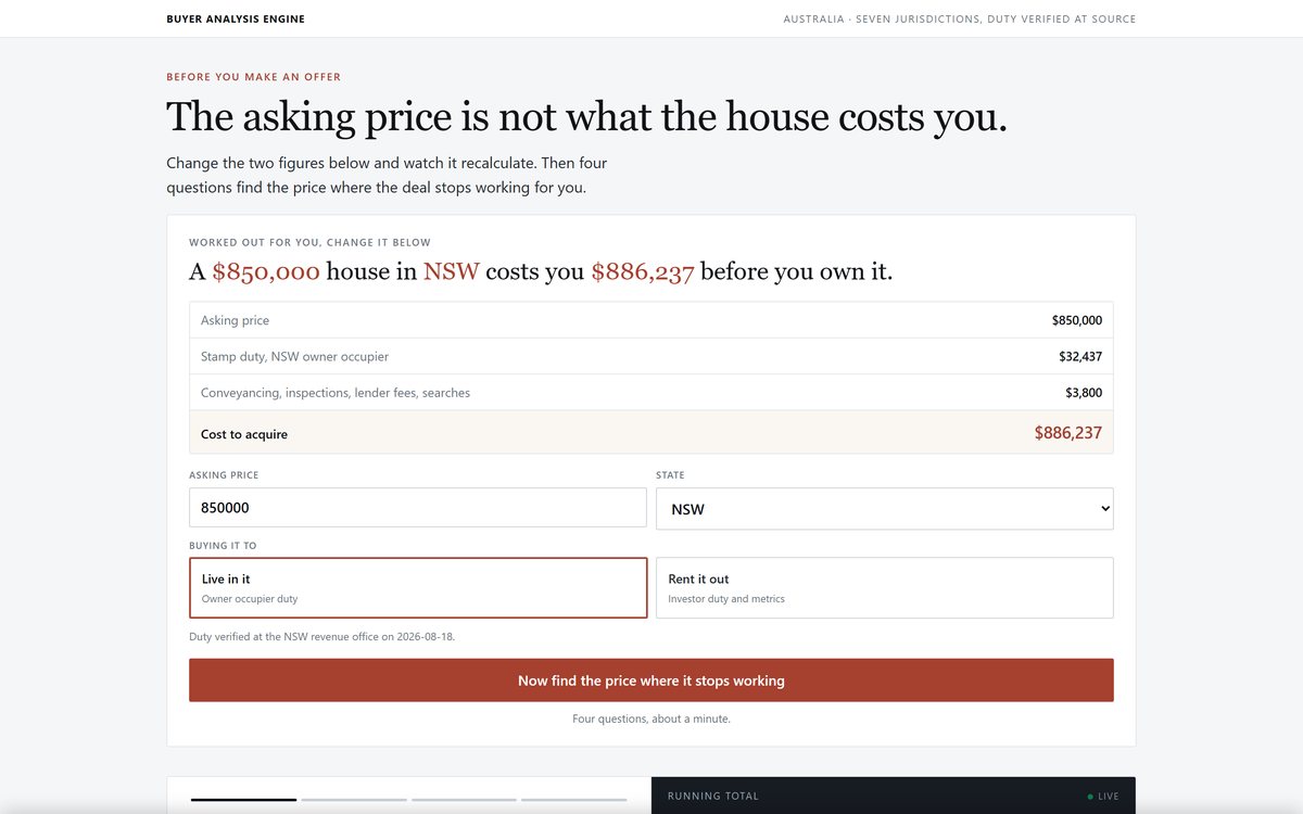
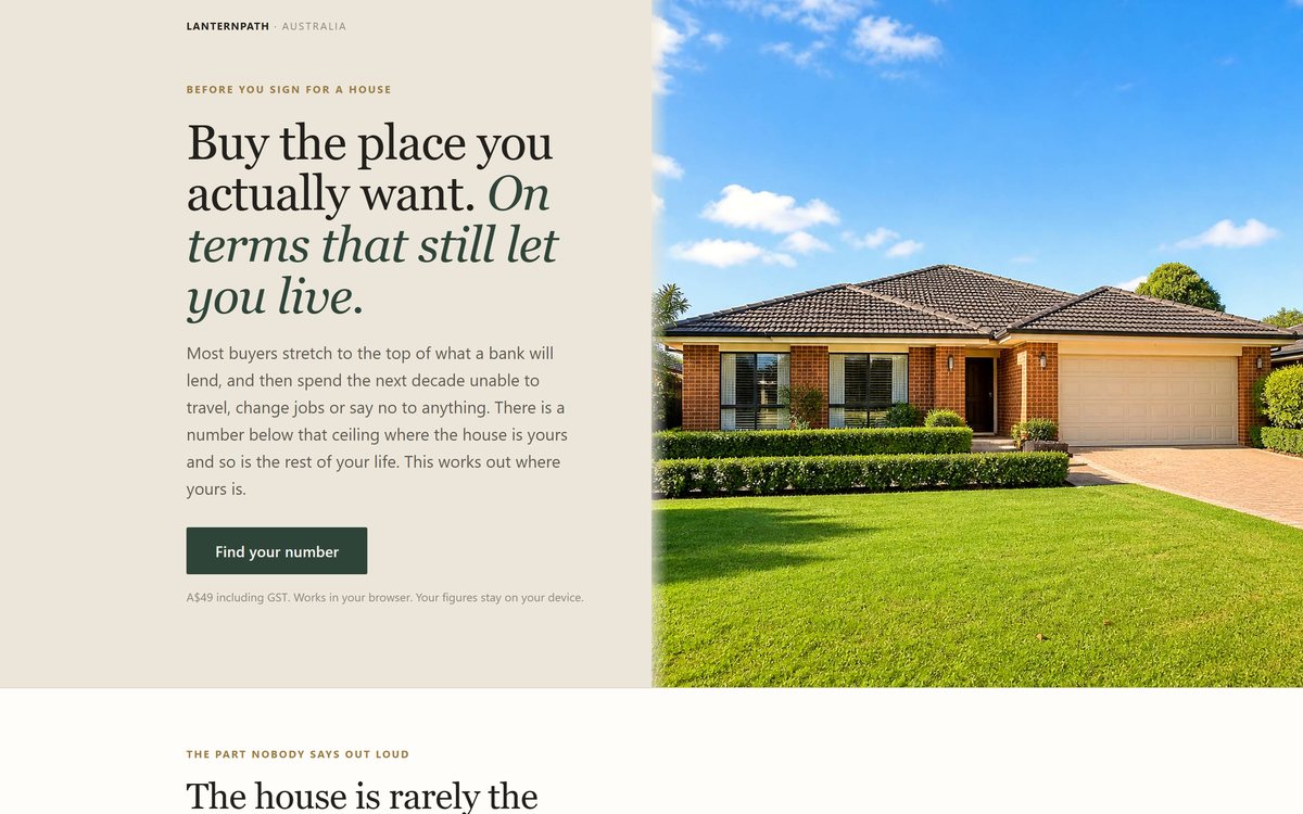
Each one exists to carry a single decision for a stranger who arrived from a paid ad and has never heard of the business. Shown but not linked, for the reason at the foot of this section.


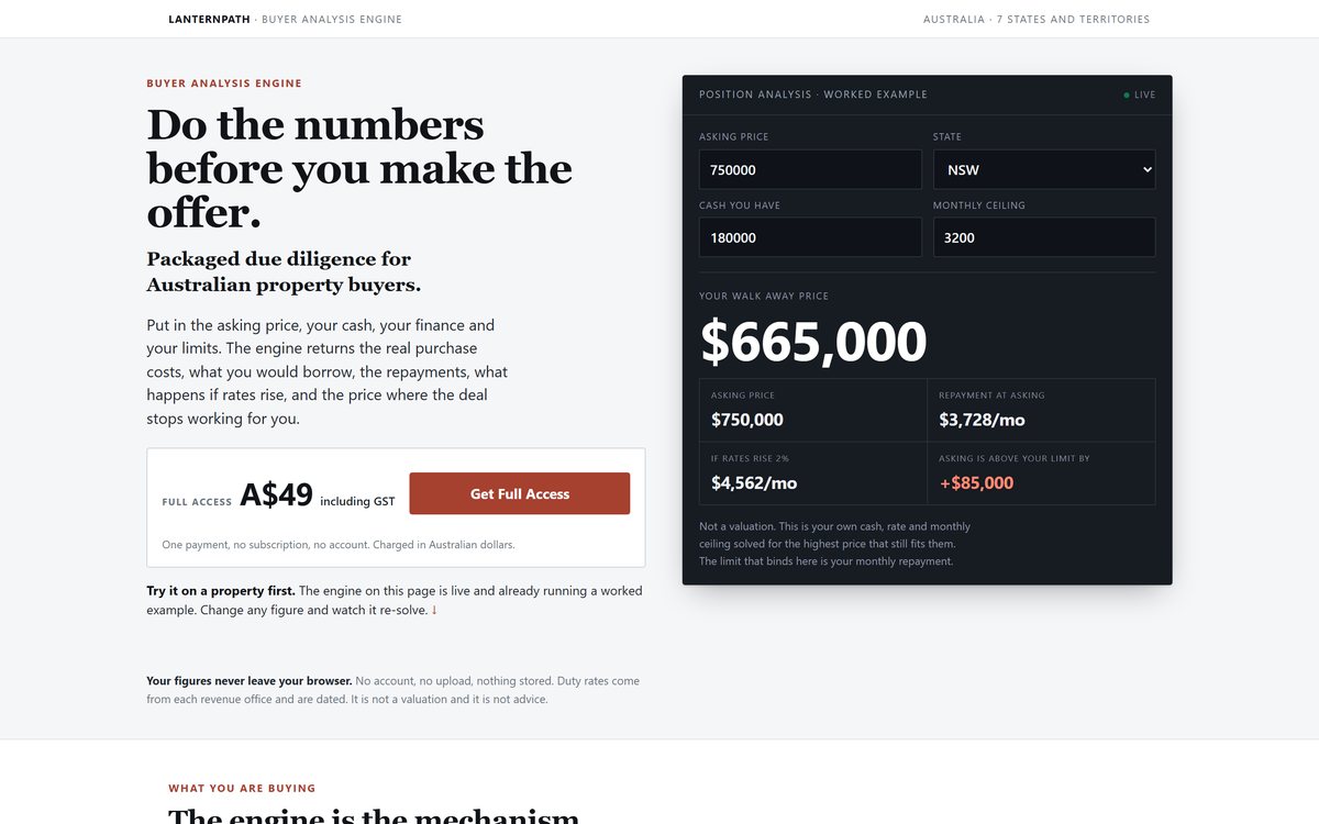
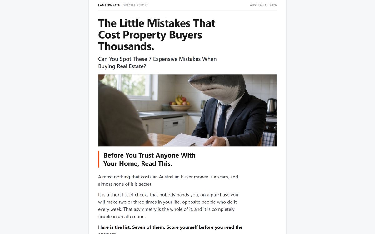
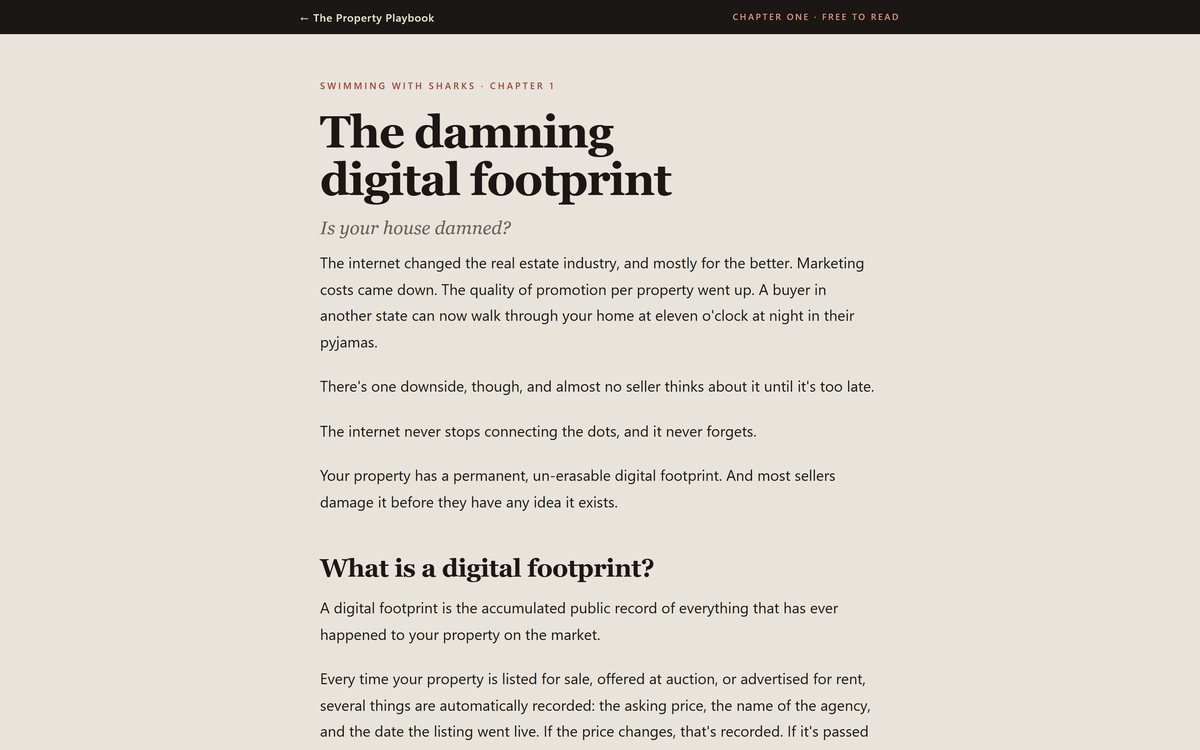
The longest page we have shipped
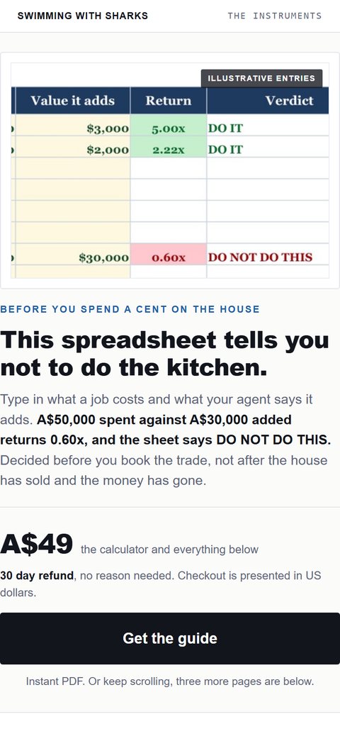
Nearly twenty seven thousand pixels of argument, arithmetic and proof, built as one continuous read rather than a series of sections.
- Animated arithmetic ledger built in code, not a static graphic
- Custom product photography and 3D renders generated in house
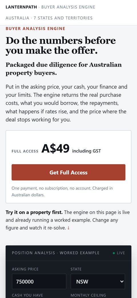
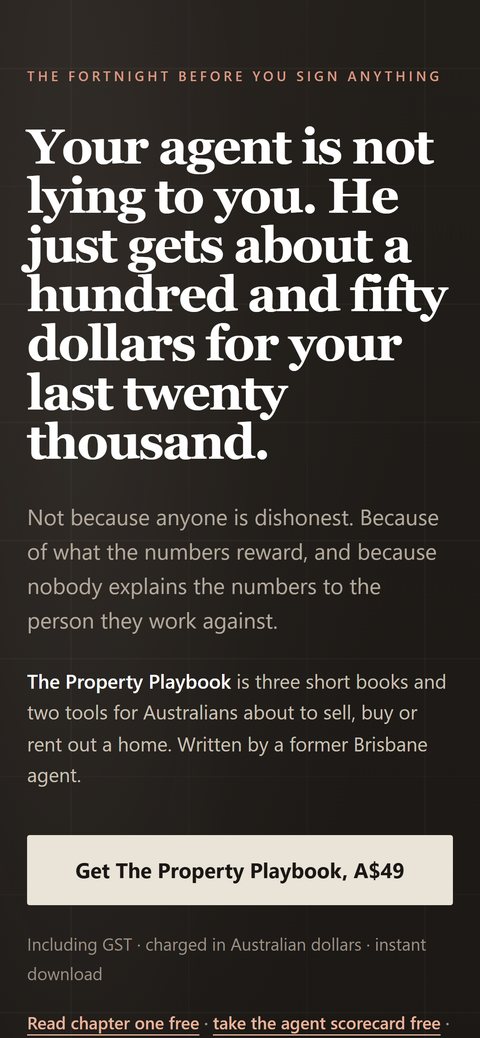
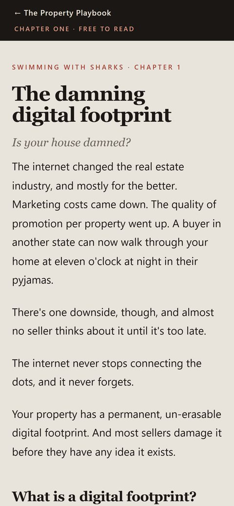
- Holds its layout from 320px to ultrawide


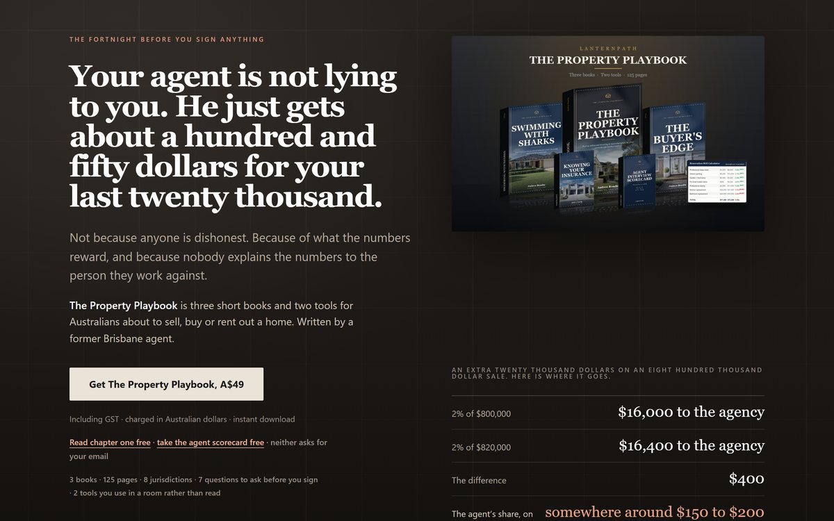
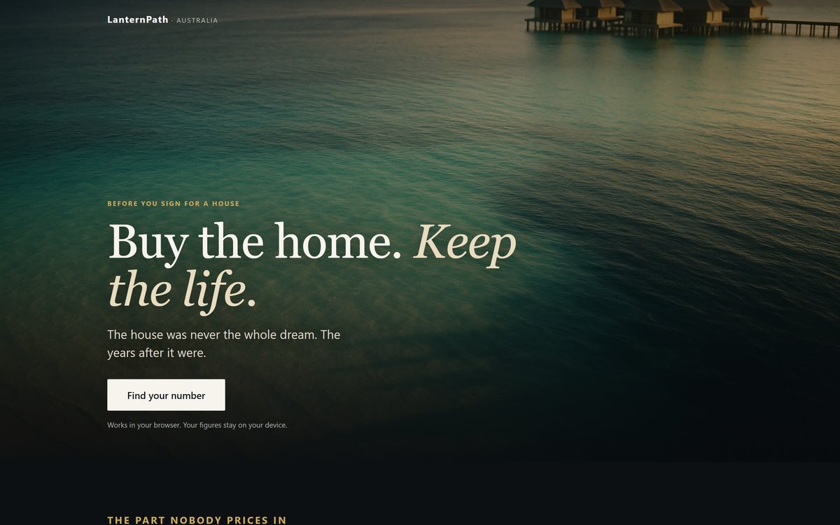
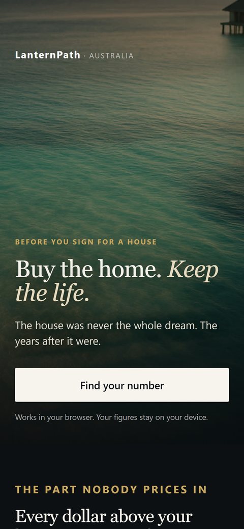
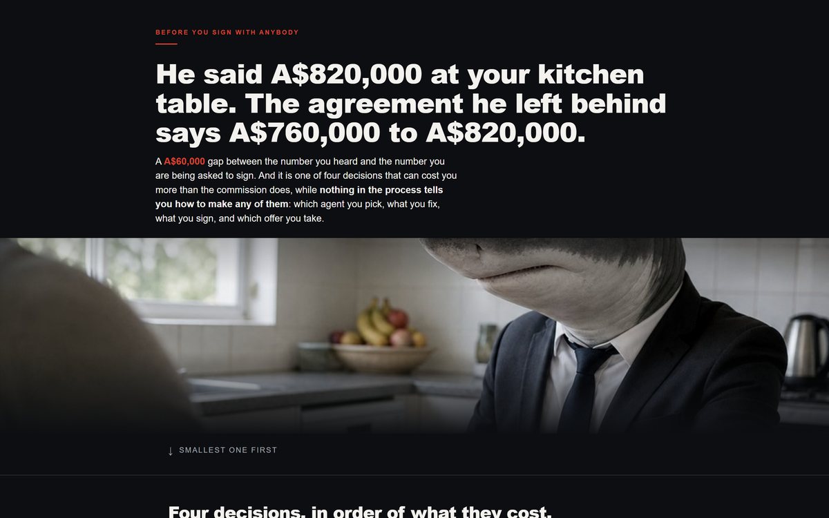
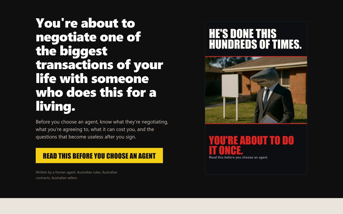
One idea, carried by a single image
The shortest of the set and deliberately so. One photograph, one contrast, and the whole page built to land a single point in the first screen.
- Entire page organised around one idea
- Photographic art direction rather than stock illustration
- Shortest of the set at 3,994px


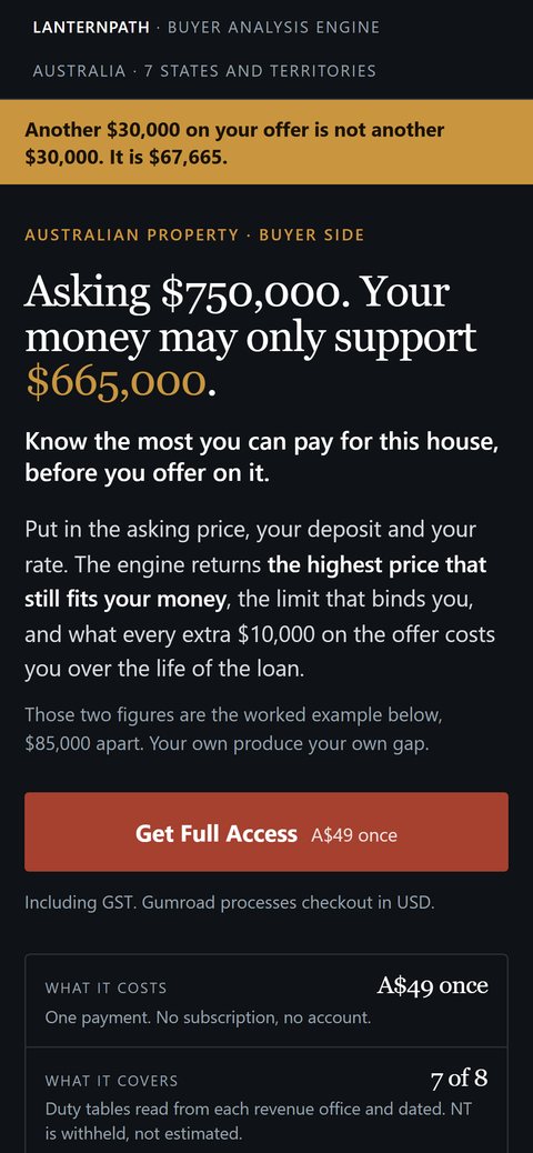
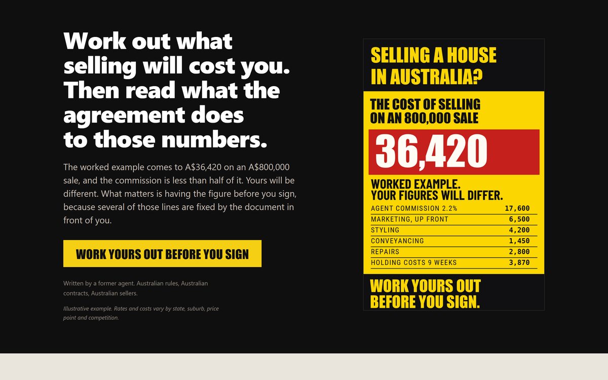
Flat colour, no gradients, no stock
Yellow and red at full strength with no gradients and no stock photography, built so a dense table of figures stays readable at phone width.
- Flat colour blocks, no gradients anywhere
- Dense figure table that stays readable on a phone
- Built to be scanned rather than read end to end


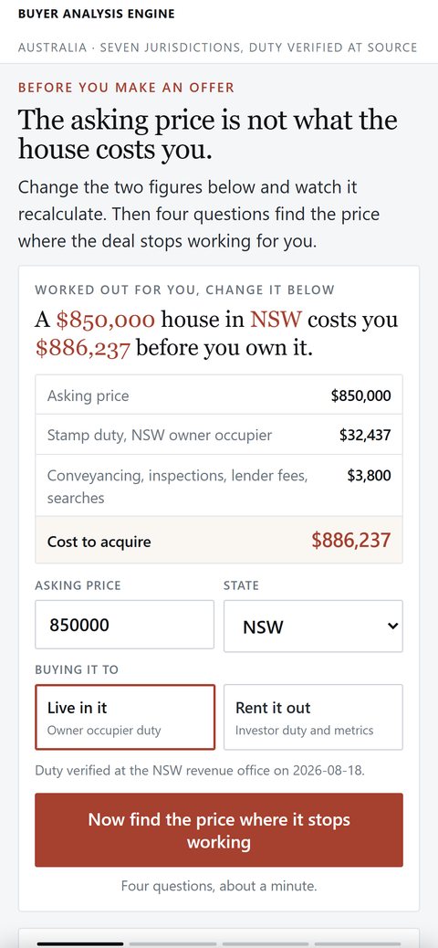
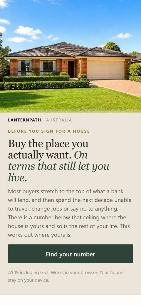
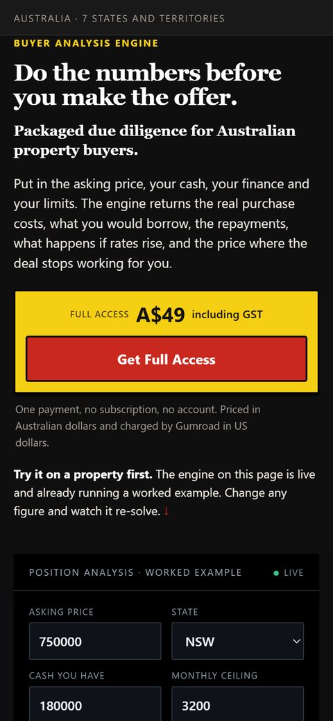
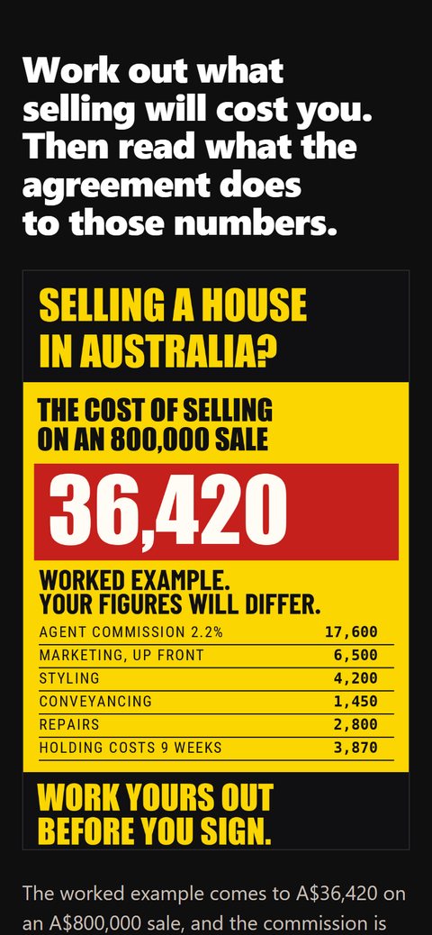
Variant build of the page above
A true variant rather than a redesign: one variable changed and the stylesheet shared, so the comparison between the two stays honest.
- Genuine variant, one variable changed
- Shares a stylesheet with its counterpart
- Same structure, different entry argument


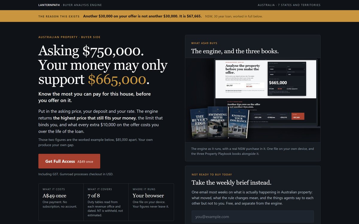
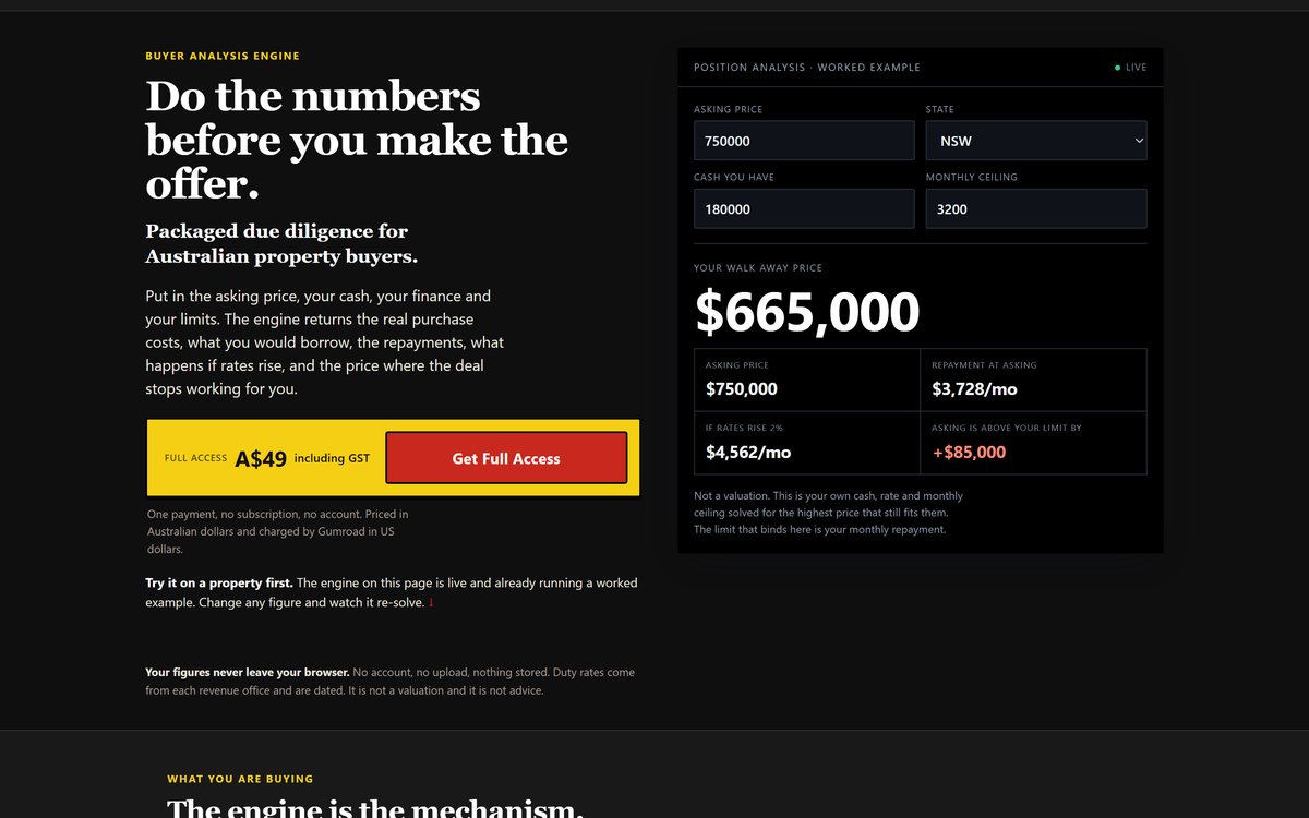
Live calculator, dark treatment
The visitor types in their own asking price, deposit and rate, and the panel resolves the highest price the deal still works at. Every figure recalculates on the page and nothing they enter leaves the browser.
- Live recalculation on every keystroke
- All arithmetic runs client side, nothing is transmitted
- The result panel cannot render an incomplete state


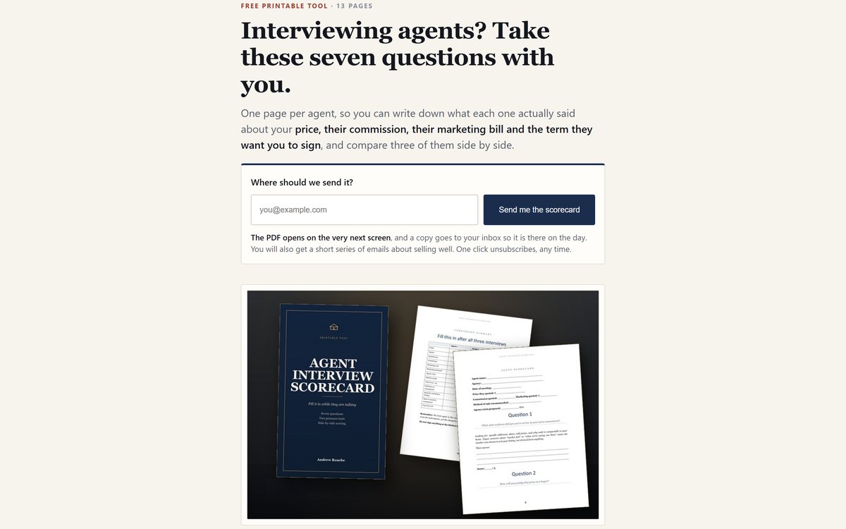
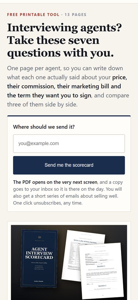
Email capture in the first screen
A cold visitor arrives, sees exactly what they get, and hands over an address without scrolling. One field, one button, and microcopy that says what arrives and when.
- One field and one button, nothing optional
- Says what arrives, when, and how to stop it
- Server side subscribe endpoint, not a third party embed
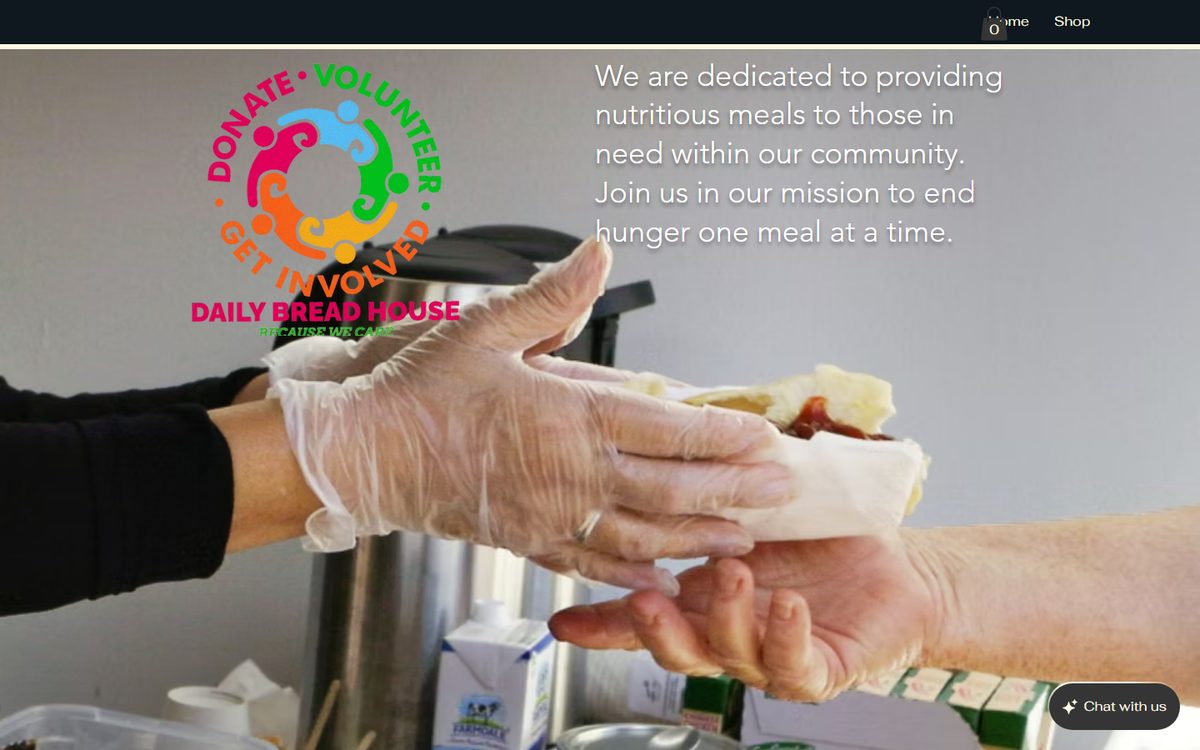
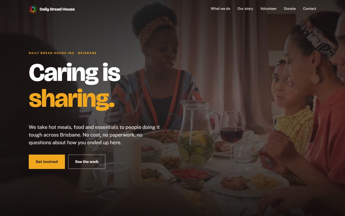
Five complete websites, not landing pages
A lander carries one decision. A website has to answer every question a stranger has, stay navigable as it grows, and still load on a phone. Both are on the work page in full, including a charity rebuild shown before and after.


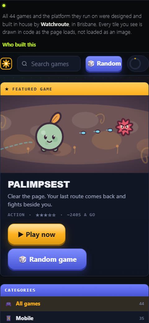
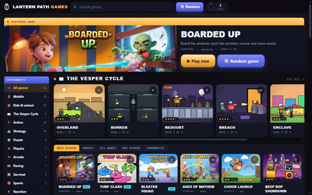
Thirty two browser games, and not one tile is an image
This is what we build when there is no client and no brief. Every tile on that page is SVG and CSS, generated as the page loads. The only two image files the whole arcade touches are its app icon and its share card.
Open your network tab and check. That is the point of putting it here: a claim you can verify in ten seconds is worth more than one you have to take on trust.
One job per screen
Each section does a single thing. A visitor never has to work out what they are looking at.
Fast on mobile data
Most visits are on a phone, often on a poor connection. Everything is built for that first.
An obvious next step
Call, quote or enquiry. Always visible, never more than one tap away.
Want a page that does this for your offer?
Tell us what you sell and who has to say yes. We will tell you honestly whether a landing page, a full site, or neither of them is the thing that will move the needle.
Start a project